Wednesday 31 October 2007

lastminute.com


taking the literal meaning from last minute, THE last minute, 60 seconds, representing this in the advert using digital lcd display watch type, this is just from the sketchbook mind you, will sort it out a bit more tomorrow

lastminute.com


Sunday 28 October 2007

Big Draw 25th October


My personal contribution for the Big Draw on 25th October at the Leeds Metropolitan University. Jo gave me a photocopy card and said to get some books and photocopy them and see what happened, this is what happened that afternoon. Afterwards I gave them to a guy called Toby as I recall, but I haven't a clue as to what he did with them but it would be interesting to find out....

Big Draw 25th October


Tuesday 23 October 2007

lastminute.com

How long have you got?

"live every last minute .com"

How long do we have left to live?
What should you spend it doing?
Life trickling away......
Sands of time (HOURGLASS)
ooh an idea....

Tutorial 23/10/07

LAST MINUTE:
- not just travel
- flowers, tickets, meals etc...
- the last minute (icon)
- eye zoom too druggy? good or bad?
- not a journey
- ryan mcguiness flatness is god

SELLF:
- critical
- tone
- not too many puns in one place
- full circle
- work becoming part of what it criticising
- absorbance into popular culture

FLIRTBOX:
- neon
- colour
- merging
- night/day ... office/play
- blowing a kiss, positioning
- logo/advert
-

Thursday 18 October 2007

FB 2nd Mock


new mock up for flirtbox - filled out logo and change of format, portrait to landscape, just a bit of a re-jig

Flirtbox


first illustrator mock-up of flirtbox brief solution, 25-30 yr old chat/date website

twenty four


my designs for the number twenty four 24 submitted for use to celebrate the library being open 24 hrs also co-insides with the big draw on 25th october apparently

Monday 15 October 2007

Monday 15th October


Update:

Just a couple of things really, looking at using serif type to combined script letterforms combined with letters to make newly subtle icons to place in text for advertising/branding work using taglines such as "all buy oursellves" and "sell£/f"

combination of '£' and 'f' characters

also grid systems using monetary units as a basis 1 2 5 10 20 50 etc...

Wednesday 10 October 2007

Paul Rand


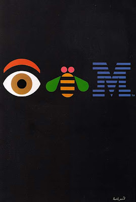
American artist/designer Paul Rand. Since we (and by that I mean the people of my generation) have all grown up with these brands, such as "IBM", "abc" and "UPS" we instantly know what they mean and stand for, even if we don;t use them. And even though they were designed over 30 years ago they haven't really dated, a testiment to the quality of the design. I'm becoming more and more interested in "quality design" something which there isn't enough of in our over-saturated culture.

Swiss Design


Swiss Design. What do I like about it? Well its the whole sort of concept through to final visual outcome methodology which I like and can really engage with. The use of grid systems, and just "proper" design! It seems that with so much software readily available people don't engage with the design as much as in the early days. This is almost art to me. The use of space to represent the information with minimal./essential flare. The content isn't over-ruled by the design, they both work together as one, harmoniously.

Foundation 33 Greetings Cards


The reason that I like these greetings cards is for their utilitarian approach to such a commonly poorly executed piece of gift related subject matter. Quite often greetings cards are shit. And by applying minimal, utility styling to them reduces them to their core ideals, What is it for? Who? From Whom? No fancy pictures which bare no relation to either the recipient, its sender, or the occasion at hand. Well done.

Tuesday 9 October 2007

I Like Work


This is the result of me looking at Swiss graphic design all afternoon and then picking and interesting quote from the book "The Art of Looking Sideways". Combining the two using a minimal graphic style. Oversized quotation marks resemble the numbers 66 and 99; which link to the two lines refer to the hands of a clock, relating to the passage of time implied in the text. Notice the detail of "work" and "for hours" in italics; a motivational device should this piece end up stuck in the studio. The blue has no real relevance other than I thought it looked lighter than a solid black.

Jerome K Jerome was an author, there is more information on him here: http://en.wikipedia.org/wiki/Jerome_K_Jerome

Concept Idea: Grid Systems

Just had the idea, possibility to base a grid system on values which currency comes in:

1p = 1mm/pixel?
2p
5p
10p
20p
50p
£1 = 100
£5 = 500
£10 = 1000
£20
£50 = 5000?

doesn't have to be those specific values. Idea links in with work based on consumerism/advertising. Obviously Money is closely linked. Perhaps the physical dimensions/measurements of the money could be used also?? Would be interesting since the size doesn't always increase with the value of the currency. (possibly euros?)

Grid System 01


First experimental grid system for laying out various design pieces. Based on the principle of a 100 x 100 square in the top left corner, moving onto a 50 x 100 rectangle rotated 90 degress, 25 x 75 rectangle and so on. These shapes then create a grid system to work off shown here in three forms. One: Solid Square and Grid Lines. Two: Solid Squares only. Three: Grid Lines only. Using simple shapes and maths to create a (hopefully) dynamic grid system to work off.

Note: These aren't very precise drawings as the work is at an experimental stage

Tuesday 9th October

From today's series of looking at books and articles these are some things which I would like too look into further (aswell as the previous things which I haven't mentioned on here and still haven't looked at):

- Ernst Keller "the father of swiss graphic design"
- "Die Neue Typographie" Jan Tsichold (an english copy would be good)
- Grid Systems (possibly apply to bad new design

"I like work - it facinates me - I can sit and look at it for hours" Jerome K. Jerome

From looking at Swiss design I have considered more the idea of mass design and its use by the individual. UNIVERSAL / personal

Also I need to buy a ruler.

Amnesty International Flyer


I've kept this flyer since having it in a newspaper a the design really stood out to me. I haven't shown it all here and you may not have seen it, or you might have. What I like about it is the strong, solid message which it portrays through the text alone, without the need for guilt inducing photographs which turn off more people than they do on. By sticking to minimal colours and using the format to emphasise the message (you read as you unfold) I would say that this is a successful piece of design. Designer unknown.

Monday 8 October 2007

Sketchbook Scans 8th October


Three scans from doodles in my sketchbook:

"All Buy Ourselves" a play on words as a slogan working around the theme of people buying their self image from the brands and products that they own and selling themselves and replacing them with products

"Self Sold" similar idea, selling yourself, being sold products/brand. typographic solutions to experimental wording

"F£" detail for development from previous sketches putting letter symbols with monetary symbols, icons and merging the two

1st - 8th October Sketchbook Update

A few snippings from my sketchbook ramblings and thoughts to show you an insight into my working practice and keep me updated and organised.

- BUY ME it's what adverts are for. Part with a piece of yourself and replace it with a product.
- The Brand sells to you, You buy The Brand, The Brand owns you, You've lost yourself.
- What is good design? Responsibility to quality design?
- Design Values?
- ALL buy 0UR$E££VE$ (all buy ourselves)
- The way people read words (Look Into)
- Is Advertising BAD - Yes/No?

"Wouldn't it be interesting if there were only one typeface in the world? Designers would really have to think about the idea behind their designs instead of covering it up with fancy typefaces. One, universal typeface would really strip away all the flashy emptiness in design. And, of course, that one typeface would have to be HELVETICA." Erik Kessels (Homage To A Typeface)

"It is basically what distinguishes branded from unbranded products...If we have a clear picture of a brand in our minds to refer to, we can handle it easily in decision making, even at lower levels of consciousness. The identity of a brand endures over time...We have the reassurance that comes with familiarity and with the sense of pattern and order this gives us." (The Consumerist Manifesto)

"We have endless views, actually, about how our washing smells, about bottled versus tap-water, about the difference between instant and ground coffee, about labels, product performance and personal gratification." (The Consumerist Manifesto)

Helvetica - Homage To A Typeface


A few of my favourite excerpts from the book Helvetica - Homage To A Typeface by Lars Muller. Nice little book celebrating a classic 20th century typeface in it;s numerous uses throughout our world. I for one am a fan, particularly Helvetica Narrow Bold.