Friday 28 December 2007

Polar Triangle


Found this on the web. Could possibly be something to think about when constructing the imagery for my book covers. Some kind if iconic image representing each book then reduced to a geometric/pixelated image pattern.

Sunday 23 December 2007

Something Like This....


This is along the lines of what I might produce with the book cover project. Geometric patterns mixed with colour and type along with an air of mystique...

The other image relates to the drinks machine logo work, but also it is a nice piece of information design.

Saturday 22 December 2007

Taiwan Recycle Logo


Found this randomly on a website, apparently it's the Taiwanese recycling symbol. Works nicely with the four inward arrows creating for white arrows pointing out. A brilliant use of dark and white space.

Wednesday 19 December 2007

More Nice Things Done By Other People


Here are some pieces of design i like and which i have found by chance surfing on the internet and stuff.

this is a really good website :http://thenonist.com/index.php/thenonist/permalink/graphis_annual_71_72/

Space Opera


Here you have the beginnings of the cover design for the Space Opera science fiction series of books. I'm looking at creating complex patterns to implant hidden messages and text within the pattern. Thinking about dual level far and close. Pretty and interesting. Working with colour and I have chosen the hexagonal shape for cell/honeycomb patterns. These are the starting points of investigation and layering and layering and layering. Keep your eyes peeled.

Thursday 13 December 2007

Audi Design Foundation


Finally got round to getting some of these icons vectorised from the pencil sketches into the computer so here are the two finalised icons fully digitised.

Wednesday 12 December 2007

Audi Design Foundation


Drawings for more icons of the beverage drink machine. Teabag drawings becoming more finalised (finally). Spoons more or less sorted for sugar. and The cow is probably being too stylised, whilst they still have the essence of cows within their icon, udders and spot,s there is also a loss of detail and realism which the other icons do not loose.

Tuesday 11 December 2007

Does seeing great design inspire you to create or does it merely dash your hopes for creating genius yourself?

Interesting things with good ideas///


These are just a few things I've discovered whilst inanely surfing the web (forkplane and pie chart badges) and also I was queuing in the post office this morning and thought what a good logo the top-up logo actually is!

Sunday 9 December 2007

Audi Design Foundation


More drawings for this brief, working on the change logo of a hand and coins, no coins here yet...still trying to work with an originally organic shape whilst keeping a cohesive style for each and every logo.

Digital Font Research


Font these the other day in a couple of books whilst waiting for my XLA tutorial with Aidan. Interesting to see something similar but different to work which I am producing.

Aiden Tutorial Notes

- Problem solving / Communications - and its aesthetic treatment / resolution should not be separated?

- Modernism - Now in 2007? Why? Is there a retro/nostalgia for these forms? International style modern?

- What is the question that over arches everything that you will do?

- Keep the blog up to date, find a way of doing this on a daily basis

- Relationship of British graphic design to continental Modernist design (Swiss, Dutch)

- Birdsall, Fletcher, Chermayeff, Geishmarih

- 1960s

- American Modern 1940-1970 (Book)

6/12/07

Wednesday 5 December 2007

Fwis Logo Design


I really like these three logo's by Fwis. Just found their work through clicking links from somewhere. There's a lot of other good work in different forms at http://www.fwis.com .

"Lv" logo for Lipstick Vine has a simple elegance which could clearly be applied in a variety of ways to various products.

"Fivehead" its again brilliantly simple. A five-sided head with eyes created for an online video website.

"PA" for Public Art the PA grabs the attention on its own in a circle but then the text below conveys the message without repeating itself.
"Fwis is a graphic design firm that specializes in fresh, concept-driven graphic design for some of the most savvy and complex companies in the world. Since 2002, Fwis has worked with such clients as Random House, Corbis, Barneys NY, Interscope, and The New York Times"

Tuesday 4 December 2007

XLA 04/12/07

The following is currently where my written work is at and is perhaps not in the correct order. Currently for the final presentation of my XLA I am considering a magazine style piece of writing with different aspects of my work split into several smaller articles rather than one large piece. I hope that makes sense.

"I like to be thorough when producing my work. Whilst coming up with an idea is a vital part of my method I also find that not producing a quality outcome can leave me unfulfilled. However I seem to come up with ideas to resolve briefs at a higher rate than I can design the outcome. Since the start of this term I have begun to understand that professionally this is not a problem and that keeping busy on multiple things is a healthy way of working. Generally I try and work on three or four things at once so that should I become stuck on one brief then I can unstick myself from another.

Another part of my design practice I have begun to develop is not only a visual language of my own but also an approach to working from idea to conclusion which whilst not reliant on using digital techniques allows them to be applied when necessary.

From the start of this year I haven't done anything like what I set out to do. Originally I had planned to produce a larger percentage of self initiated work; however I have ended up working on more briefs and as a result they have created a different kind of self initiated work than I had anticipated.

My work feels healthy; in my approach and the quality of the outcomes. It will be important to continue with this in the future. Something I do not want to do is limit my work by forcing it to sit in a specific genre or style. But at the same time I want to develop my own visual language as well as quality control. I want to use what is a appropriate to the design rather than what I want to do.

Within my practice I want to question the conventions, which are currently set in place, and basically ignore them; unless by using them I also ignore them. For example in advertising tits and smiles cover a nice creamy strap-line of lies. But I don't want to design this so I don't. I'm sure that commercially this is suicide but I'm fed up of it.

I have attempted to do this when working on the lastminute.com brief. By moving away from the product and supposed target audience, I instead have looked at the concept of tempting people in with more of a situation-based piece. Looking at visualising THE last minute and intriguing people into finding out more through a well designed piece, rather than the promise of sex.

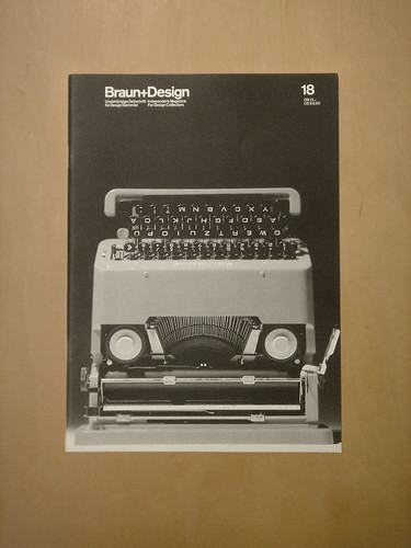
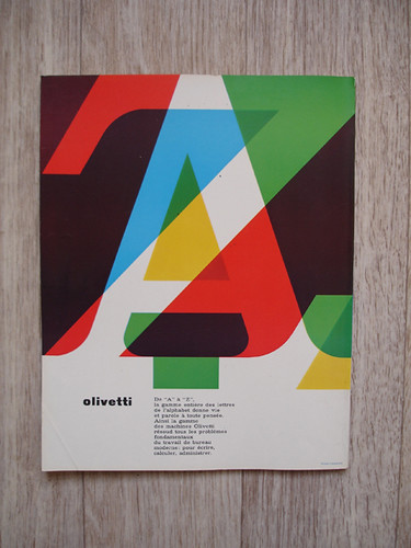
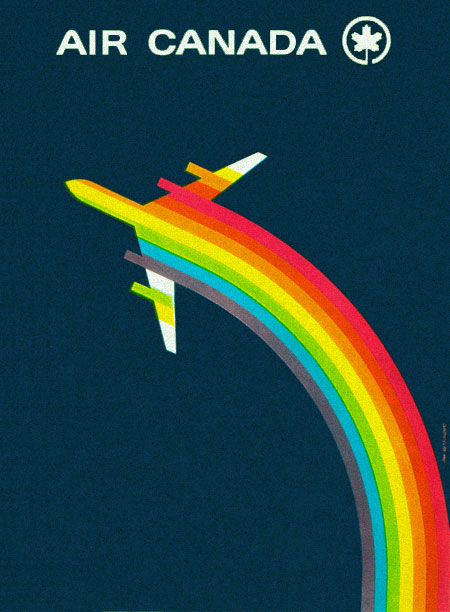
Influencing my work is a lot of what I deem to be "classic" and "quality" design. By this I mean work, which has stood the test of time as still looks fresh and timeless today as much as it did twenty, fifty, or more years ago. Examples of designers I am interested and work well as an example are Jan Tsichold, Ernst Keller and Paul Rand. Whilst these are obvious influences you can't deny their quality and this is something I want to convey in my work. A quality piece of design is timeless, its simple.

If I were to describe my work in a short simple way I would say bold, dynamic and meaningful. Boldness very much influences the visualisation of my work; using thick-cut lines and large areas of colour or lack-thereof (white space). Dynamic due to the perhaps utilitarian nature of multi-cultural visual message and the development allowing pieces to work in different situations such as colour or b/w; or in other languages. Meaningful links in with the iconic or logo nature of my work where more than purely the visual message is shown but also the unseen but communicated information; for example the cache that a brand would convey on any product in any place no matter what: A Disney branded gun would be more fun to a child than a US Army branded one.

Something which I want to avoid in my work relating to branding and advertising is being hypocritical as whilst yes in an "ideal" world brands wouldn't play a role in which goods you and me would buy, in this world they do and I am guilty as charged when buying certain brands over others for what they represent. So whilst having a critical and anti-consumerism edge at some points, I also don't want to suppose that I don’t succumb to brand identities."

Digital Font Type01


Scanned in working out dimensions ready to import into Illustrator/Fontographer to produce final font. Drawn on a mixture or graph paper and tracing paper using pen, pencil, and ruler. 04/12/07

Monday 3 December 2007

overflow 1

I started the year watning to produce my own self inintiated work focussed on the "evil" of brands and advertising and to some extent be anit-consumerist. however in the same turn i did not want to produce anything which was hipocritical from my own beliefs, perspective and actual actions. so being anit-consumerist all the way would be wrong becuase i by things becaues of which brand ti is or isn't and stuff like that.

however once i sat down to do work i ended up doing a lot of briefs and found that the best way to get out my ideas and things was through the briefs erather than my personal work which took a back seat but also developeed and gained new sectiosn via off shoots from briefs (like the lastmintue.com/digital font). working in this way to produce a personal style rather than some overblown ideological anti-consumerist ranting.

Rambling!!

The following rambles originate from the start of the year before formulating into my previous proposal:

"Advertising. Commerce. Consuming. Okay I admit it. I am a consumer. In the modern world of global warming, ethical products and mass marketing it is almost a sin. Is it? We're all consumers whether we like it or not. To be truly self sufficient is virtually impossible because the world revolves around money. Buying and selling. Whilst I have admitted my consumer status, I am rarely swayed by advertising, in its numerous forms in our society. I can't remember the last time I saw an advert and had to buy what was being sold to me. I don't walk past a bus stop and suddenly have an urge to buy perfume, or a burger or see the latest box office film. As a means of communicating information it is becoming more and more difficult to stand out from the crowded streets. Too much information. We are overloaded by visual information, even when trying to seek out specific information we become side tracked by some more information. You're watching tv, but your on the internet aswell with a magazine open next to you and there's a half read novel in your bag and the latest record is playing through the stereo, plus people wanting attention. This isn't really going anywhere."

"Design for the masses. Something for everyone that's useful. I want to create work which could be mass produced, and yet is personal to each individual. The Every-brand. I am interested in consumerism, advertising and marketing, its effectiveness in the modern world. Physical design which has a value to its owner. Everything is becoming too disposible, music, media, the written world. Virtual life isn't everything it's cracked up to be. But it is great aswell. What does an mp3 look like?"

"I want to address consumerism and advertising in the modern world. Look at how effective advertising still is in its proliferation throughout our day to day life. With so many brand messages alerting us to new products continuously do we stick with a brand or change. How does design affect this? What role dose it play? Should designers take responsibility for the information overload? After all we make it look nice. Are you more likely to buy a brand because you prefer it's logo over another? Despite its attached stigma?"

I hope these have been interesting

Learning Agreement

(From October) Learning Agreement/Statement of Intent:
"For my final project in Level 2 I looked at the general public’s addiction to celebrity and “reality” television; highlighting the fact people are constantly under daily surveillance and caught on camera, as much as if not more than celebrities.

My work is often concept led, looking at the idea and information behind the design as much as the design itself. Moving on this year I want to look at consumerism and advertising through design. The way in which the design of a brand can make or break it, and the values which are associated with it; positive or negative. I do not intend to aim for a specific outcome. Rather I would prefer that my research and opinions inform the manifestation of my work. I have always found using typography and layout to be my strengths and as such my final outcome will most likely display a preference towards this. Influencing my work is Modernism and Swiss design, with their clean lines and geometric shapes; mixed with contemporary work by The Designer’s Republic and Anthony Burrill amongst others.

I am interested in the personalization of design, where mass produced objects become personal to an individual through their preferences and use of a product; from something a simple as a t-shirt to an iPod. Self expression in the face of advertisement overload."

(From November/December) XLA:

"Since the beginning of the year my work has taken a different route from what I had proposed, however I do not think that this is a bad thing. By allowing my work to take its own path I have re-discovered how enjoyable design can be. Whilst trying to work dynamically on a range of briefs I have begun to develop what I deem to be my own graphic language, something I haven't done before. Strong influences for this are taken from Modernist design, with strong colours, shapes and discipline mixed with a more light-hearted pop culture tinge.

Public Transport Poster


Responding to the brief to encourage strangers to talk more on public transport I have devised a code of conduct for people to abide by when talking to each other instead of purely getting them to talk. The first draft of the rules is outlined on the previous post along with a couple of examples of London Underground posters.

Also included in this post is some information about the font specially designed to use on public transport and the underground.

Public Transport


Official
Public Transport
Conversation Guidelines
2007/08

1. Be polite

2. Talk clearly at a reasonable volume

3. Do not be threatening

4. Be friendly

5. Perhaps discuss common themes, such as the weather

6. Use appropriate language

7. Enjoy the company of others

8. Maybe you could compliment someone on the way they dress

9. Remember not everyone is a nutter, but always proceed with caution

Follow these basic rules and use your common sense and soon society will be a harmonious place. Enjoy the ride.

Department of Transport

Digital Font


Development of the digital font following on from the lastminute.com brief. Eventually this will result in two fonts. One working as close as possible to the original format. The other using all different angles and sections creating a more versatile font.

Flirtbox


Further development for the Flirtbox brief (online office worker chat/flirt website). This is sort of a storyboard/comic-book poster documenting the journey from logging on to pairing off.

YOU (me)


One of the Roses briefs asking for a self-portrait using design. The idea is to produce a poster containing Vital and Un-Vital but quite interesting statistics which will obviously incredibly well designed and presented. There is the possibility that the overall design could be an empty vessel with which to fill in anybody's details. This piece of work is still very much at the early concept stages.

Possible categories can be seen in this sketchbook page.

Audi Design Foundation Part 2


These drawings are more refined development of the sketchbook drawings. With these I was trying to set out the dimensions manually before converting into a digital version using Illustrator. whilst still not entirely sure that a teabag is an international symbol of tea it is currently my favourite way of visualising the beverage. I and still developing what is the appropriate way of showing a teabag.

Also included in this post is a page from "World Without Words" by Michael Evamy. Part of ongoing research.

Audi Design Foundation


For this brief I am designing a set of icons to be used on a text-free drinks vending machine, I am currently working on hot drinks however there is potential for soup and cold drinks.

these sketches are from the early stages of development outlining the general visual approach for the work.